LEGO Klik
2021-07-01 / DK
Client
LEGO
by
dearstudio
Collaborators
Tags
Dearstudio was asked to help LEGO establish their own internal design system, named Klik.
The Klik Design System contains the resources to create user interfaces for all new LEGO internal digital products, to help build unified user experiences across its business systems – helping teams to work well.
As "the value of a design system is proportional to its amount of users", work began on three axis:
- improve existing components, develop new components
- ensure buy-in and ownership across the (digital) LEGO organization
- prepare foundations for maintaining the system at scale
At its core, Klik is a thin layer atop Chakra-UI, so building new/missing components would have to be built with the same tech (React, TypeScript) and conventions. That was a (honest) challenge - and it took almost a year before we landed PRs on the Rating, RangeSlider and Dropdown components.
The (digital) LEGO organization is composed of 4 user groups: Consumers (Kids, Family), Shoppers (Parents), Colleagues (internal tools) and Partners (portals and tools for external partners). (LEGO Education is considered its own entity.)
Klik was designed to cater for the "business" segments (Colleagues and Partners), and it became clear that what was needed to ensure one design-system was to support different "dialects" to facilitate the visual- and interactive language of the other user groups.
We moved to setup a Design System team, aligned with LEGO Brand and composed of designers and developers from all user groups, and started developing a design-tokens based shared Figma file in close collaboration with the "Shopper" team (primarily delivering the lego.com and online shop).

Once tooling was in-place, this would allow us to design a component once - and by swapping in a user-group specific design-tokens set we could render the component with the chosen design.
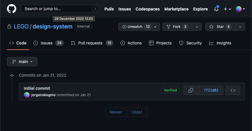
Making this maintainable and performant at scale was key, and a exiting journey begun to validate the technical concept, align on work processes, CI and code-owners (centered around LEGO's enterprise Github), development of POCs with various alternatives to chakra-ui, evaluation of existing design-system-based component libraries and alternatives to React - in order to build something now, that still would be valuable and useable in 5 years.
Internal alignment, community-building, on-boarding of new Designers and Developers, ask-me-anything sessions, leadership presentations and on-boarding of new team members sat a brisk tempo.
We even battled on how fast we could ship a fix to bug-report ;) (Less than one hour from it was reported on the support channel on Teams, triaged by two devs, issue created in github, fix developed, tests-, CI and release built. Good times!).

Our work on the strategy side of implementing a LEGO-wide design system lead to the creation of the LEGO Design System, where Klik would be a "dialect" with visual appearance tuned to internal business applications, and the addition of specialized visual dialects for Kids-, Consumer- and Education-facing applications.